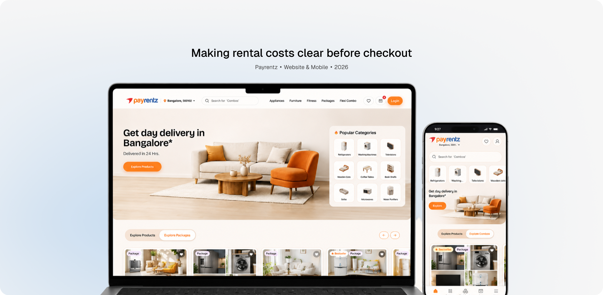
01 · Overview
PayRentz is a furniture and appliance rental platform operating across selected cities in India.
Renting comes with questions around price, tenure, trust, returns, and what happens when something goes wrong. I started by auditing the existing experience and looking at the journey from a renter's perspective, then used those findings to shape the UX direction.
The redesign explored how clearer navigation, transparent pricing, and structured product information could reduce friction across the rental journey.
My roleAudit, competitor analysis, mobile wireframes; shared hi-fi
Timeline10 weeks · 2026
Team3 Designers
PlatformWebsite & Mobile
View Live Website ↗Outcome
The redesign went live in September 2026. The client hasn't shared post-launch numbers yet, so what follows shows design intent, not measured results.
02 · The problem
The problem
The existing PayRentz experience had more problems than visual inconsistency.
Users had to figure out what to rent, how much it would cost, which tenure made sense, and what would happen after renting, with very little guidance or reassurance.
03 · Before & After
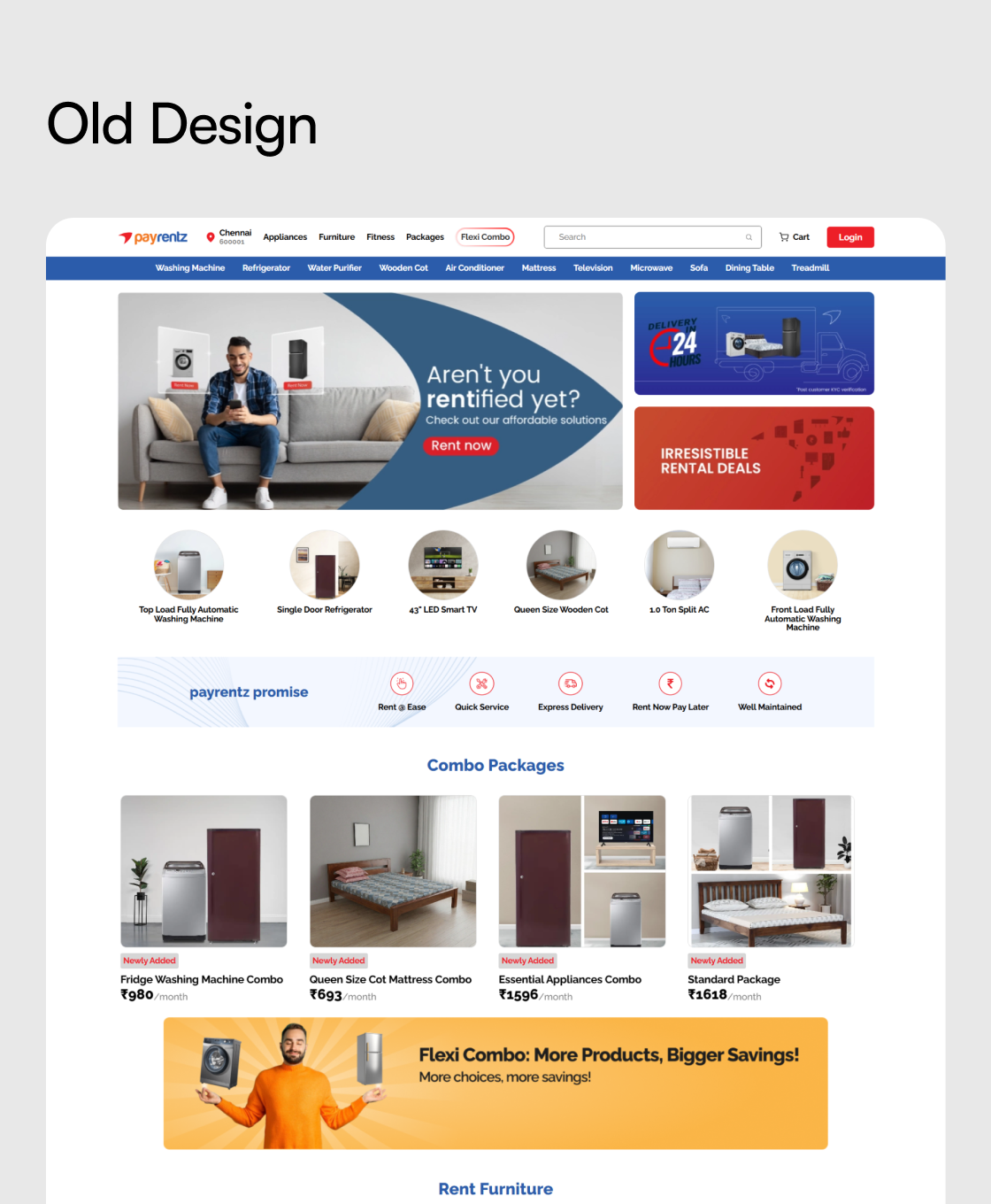
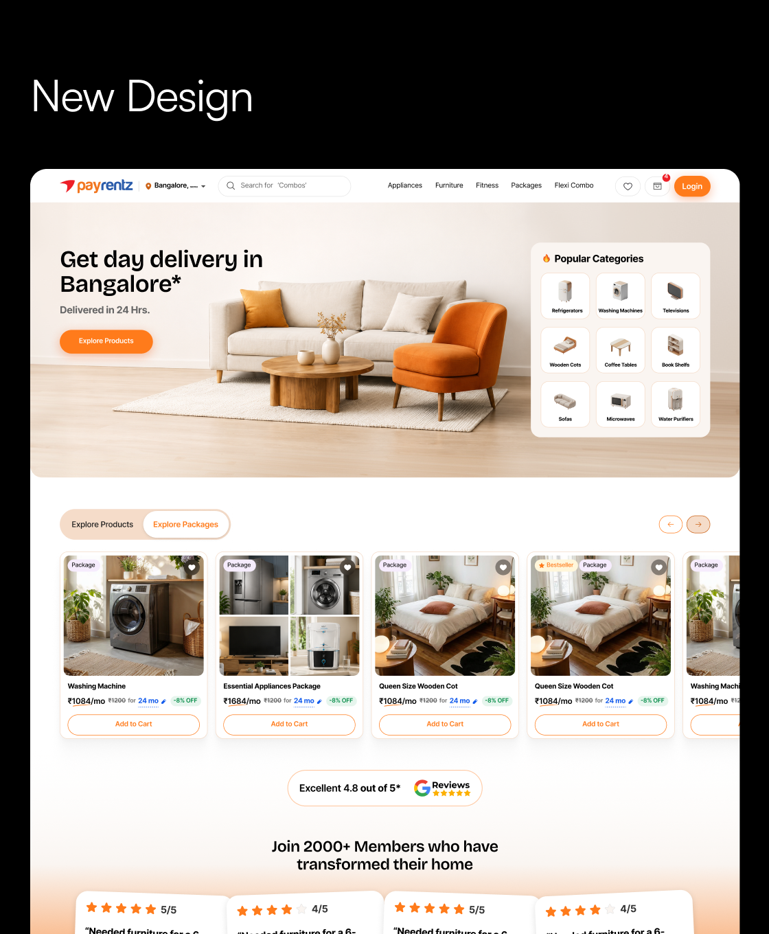
Before and after
The old homepage on the left, the redesigned one on the right. Details follow below.
04 · Structure of the project
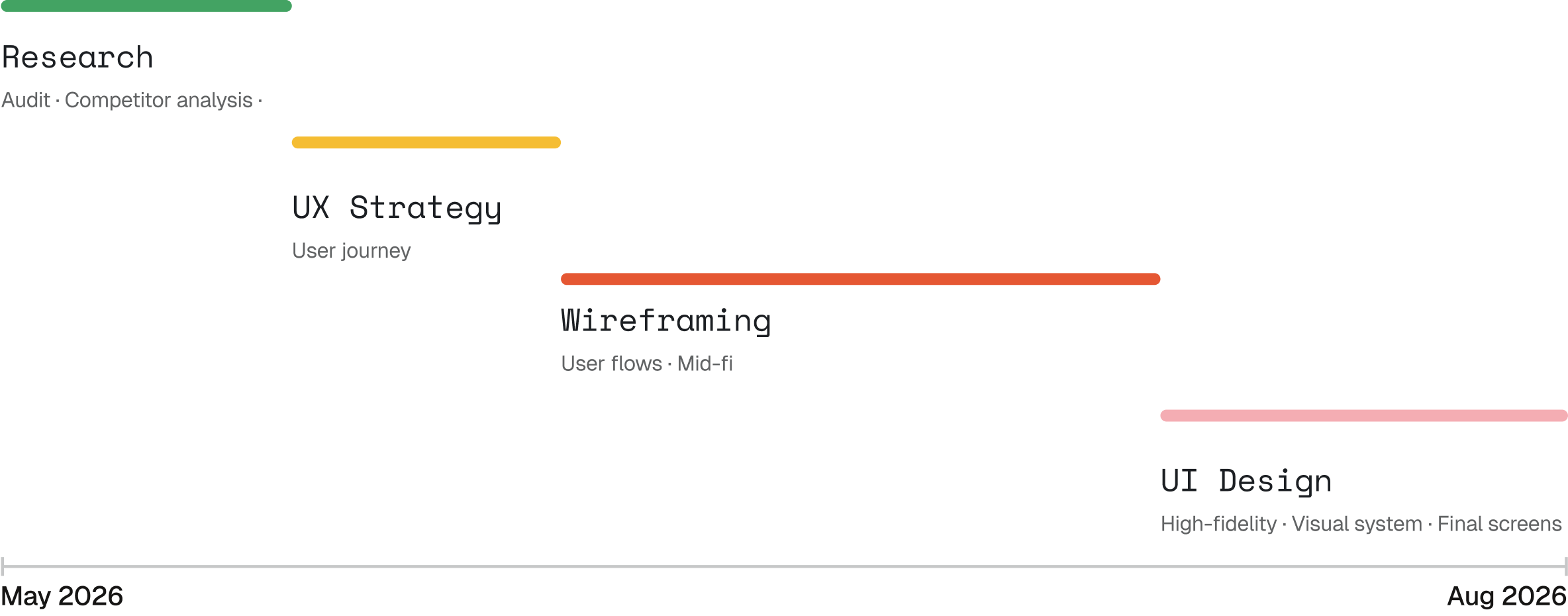
My role & the timeline.
I was the junior of three designers. I did the product audit, competitor analysis and mobile wireframes, from home through checkout plus account pages. High-fidelity UI and the design system were shared. I proposed ideas like the category icon grid and the tenure slider; we decided as a team.
Tools: Figma, Figma Make, FigJam, ChatGPT, Claude
05 · Conducting a product audit
Understanding the Existing Experience
I started by analysing the existing website page by page. I documented what was working, what was creating friction and where important information was missing.
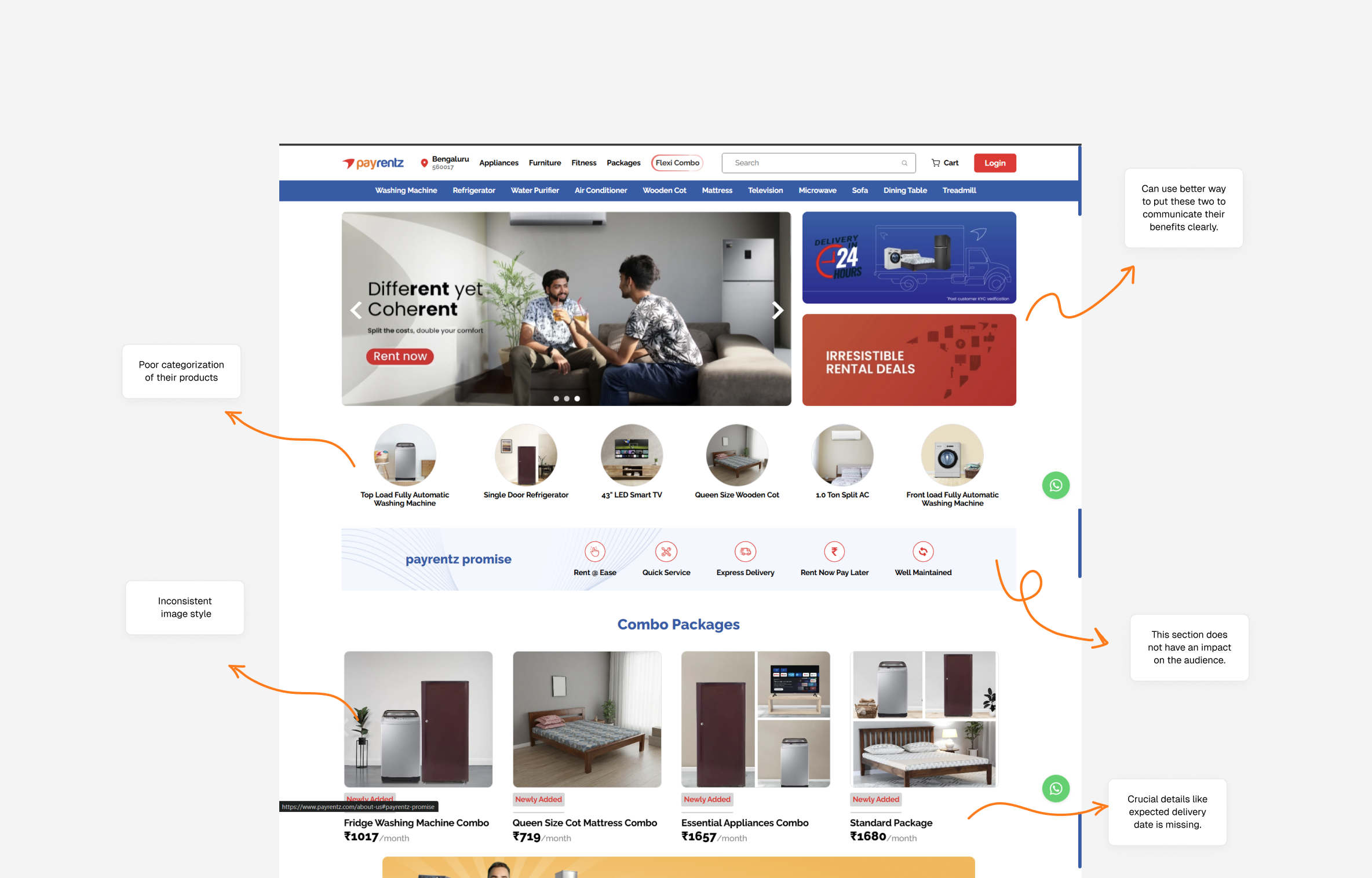
Key Findings from the Audit
01
Important details were scattered
Price, offers, and delivery availability were hard to see together.
02
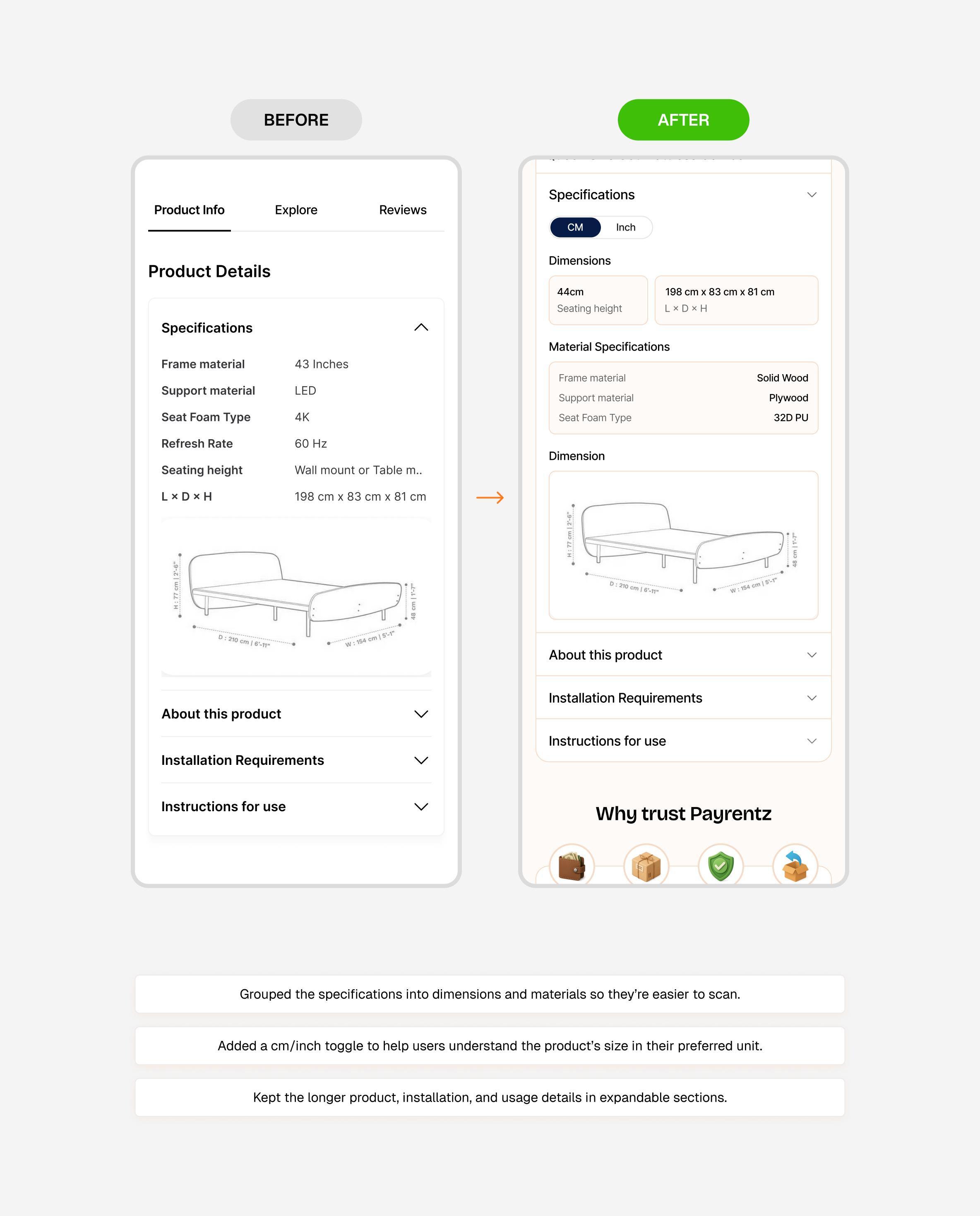
Product information was hard to scan
Specifications needed clearer grouping and hierarchy.
03
Tenure pricing was hard to compare
Users needed an easier way to see how the monthly price changed.
04
Visual style felt inconsistent
Product images and UI elements didn’t always feel like part of the same page.
05
Unclear cost breakdown at checkout
The total and its components needed a clearer breakdown.
06 · Competitor Analysis
Learning from other rental platforms
I studied furniture rental and e-commerce platforms like Furlenco, Rentomojo, CityFurnish, GuaRented to understand how they helped users find products, compare rental plans and make decisions.
FurlencoRentomojoCityFurnishGuaRented
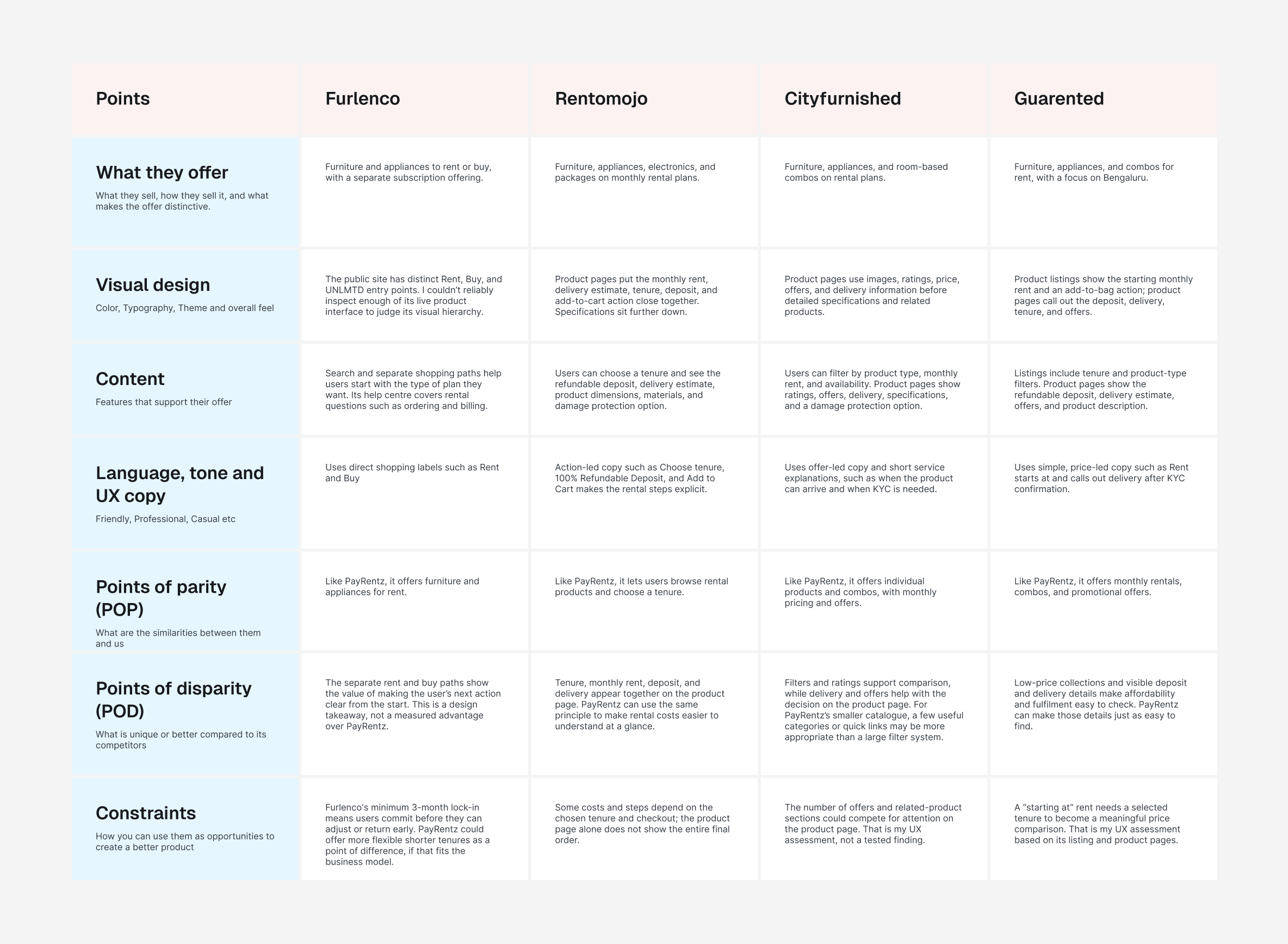
Key Findings from the Competitor Analysis
01
Competitors surface delivery, deposit and return information
Delivery availability, deposits, and returns are things users may want to check before deciding.
02
Competitors show ratings and reviews on the product page
Customer feedback added context beyond the product description.
03
Competitors organise products with categories and filters
Users could narrow down options and find what they needed faster.
04
Competitors show an itemised cost breakdown at checkout
Users could see how the final amount was calculated.
05
Competitors list dimensions, materials and included items
Dimensions, materials, and what’s included helped users check whether a product would work for them.
07 · Constraints
Why was this tricky?
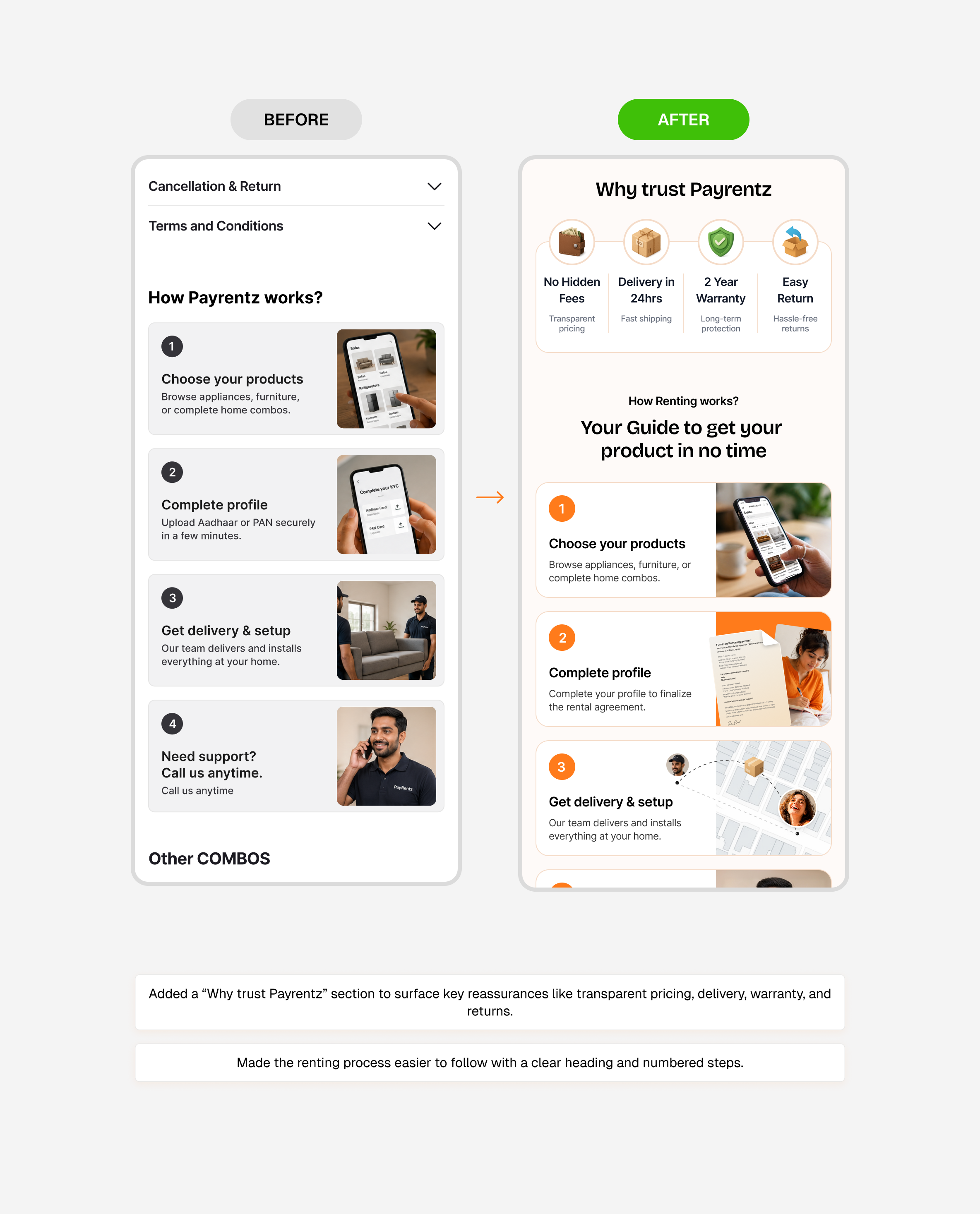
Renting is more than a purchase decision. Before they commit, users need to weigh up price, tenure, flexibility, product quality, delivery and what happens if it all goes wrong.
01
Most traffic is mobile
Monthly cost, deposit and rental duration should be visible early, burying pricing information undermined trust and caused drop-off at the checkout stage.
02
Various product categories
Furniture and appliances have different requirements, thus needing scalable patterns across categories.
03
Limited number of products
The experience needed to support the current catalog without over-engineering for scale.
04
Prioritizing What Matters
Limited screen space meant that vital information and actions were prioritized without clutter.
05
Different rental tenures
Users should be able to easily understand monthly pricing, tenure options and commitment.
08 · Design explorations 01
How do you want filtering to work when you have a limited number of products today but you need to scale for tomorrow?
The challenge was to find a balance between keeping filtering simple now and making the system flexible enough to scale later.
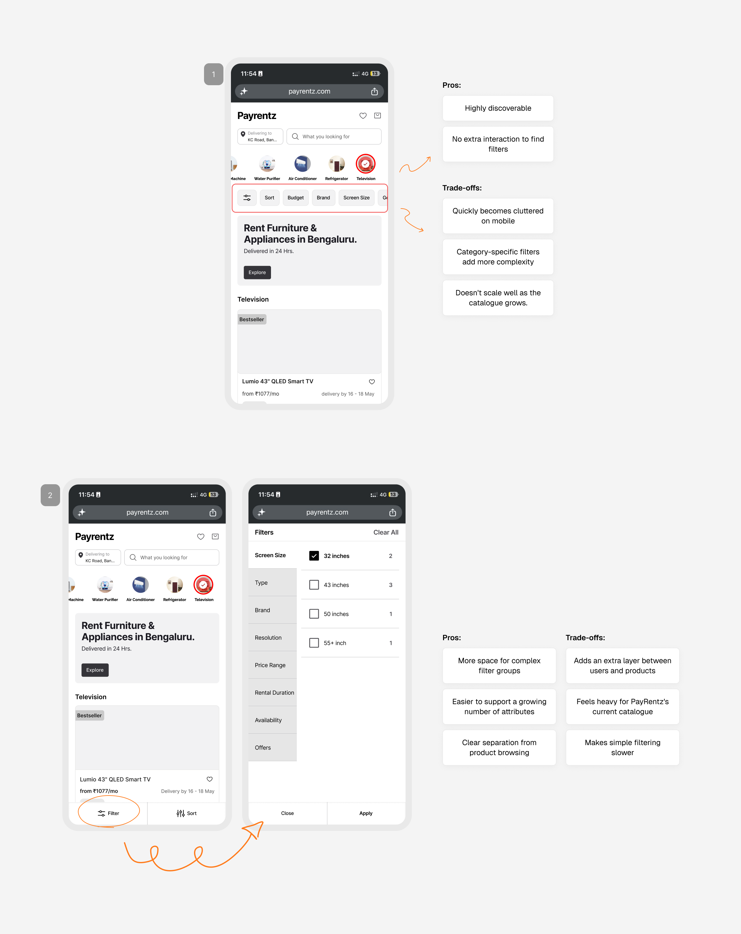
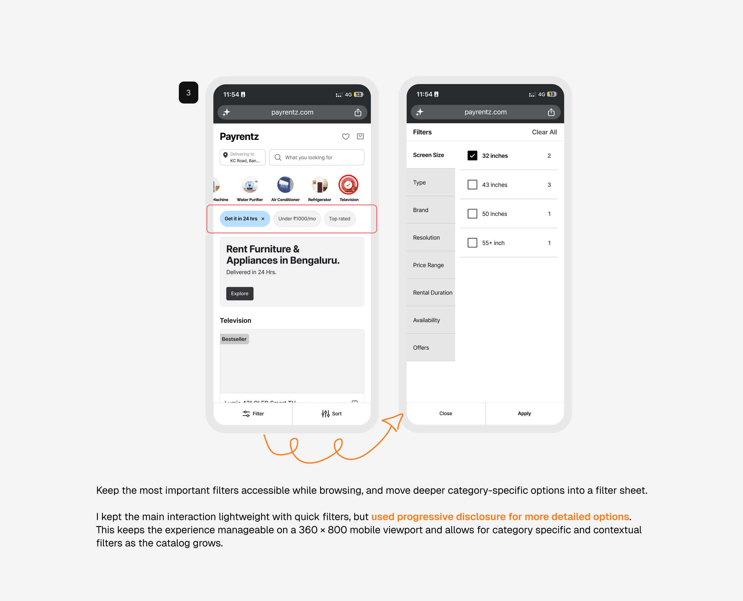
Keep the most important filters accessible while browsing, and move deeper category-specific options into a filter sheet.
After I compared these two options, we chose quick filters for the most-used options and a filter sheet for the rest. This keeps the experience manageable on a 360 × 800 mobile viewport and allows for category specific and contextual filters as the catalog grows.
09 · Design explorations 02
How do you help someone decide if a product is worth renting?
Users need to understand the product, monthly cost, rental duration, delivery, and service policies before they feel comfortable committing.
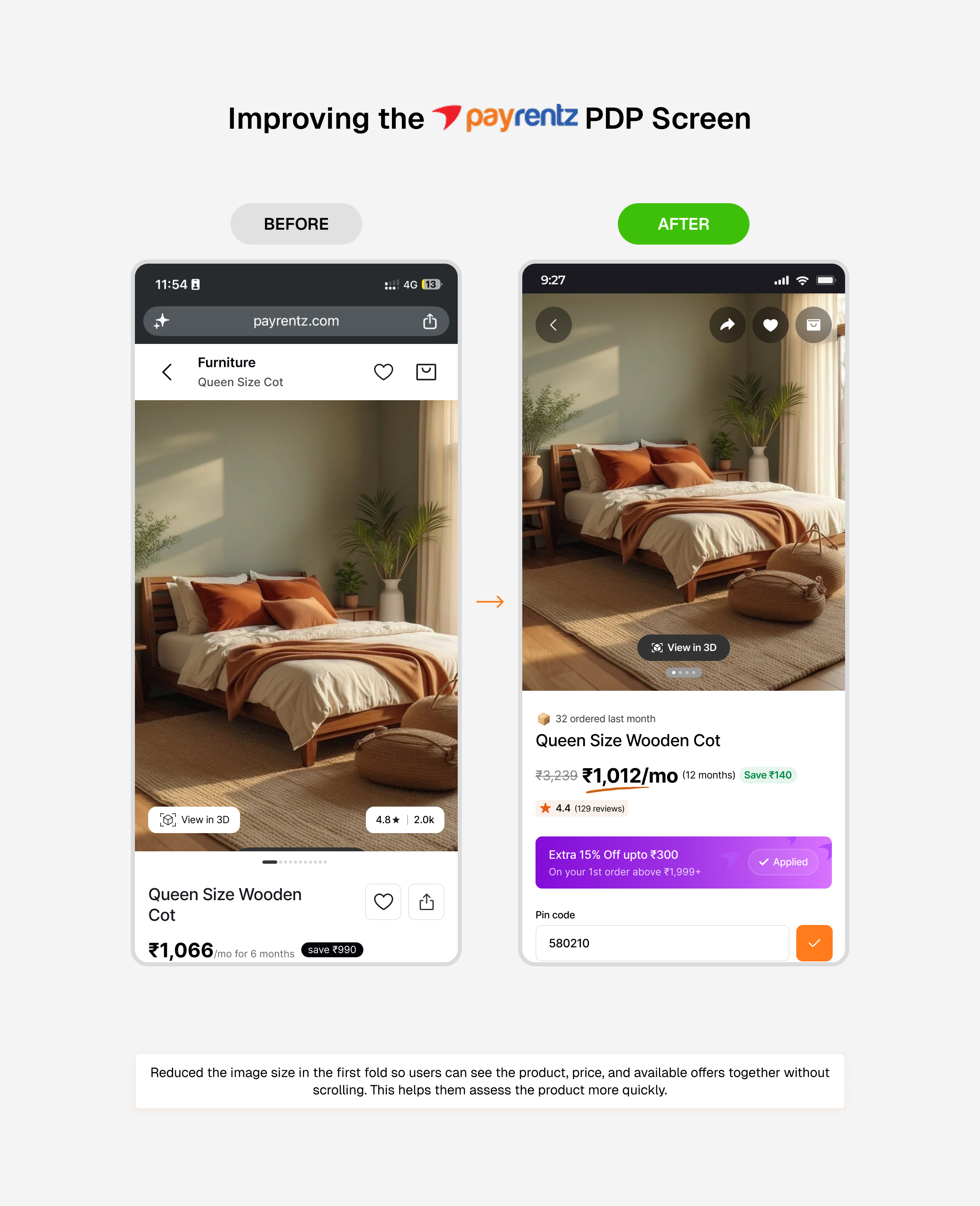
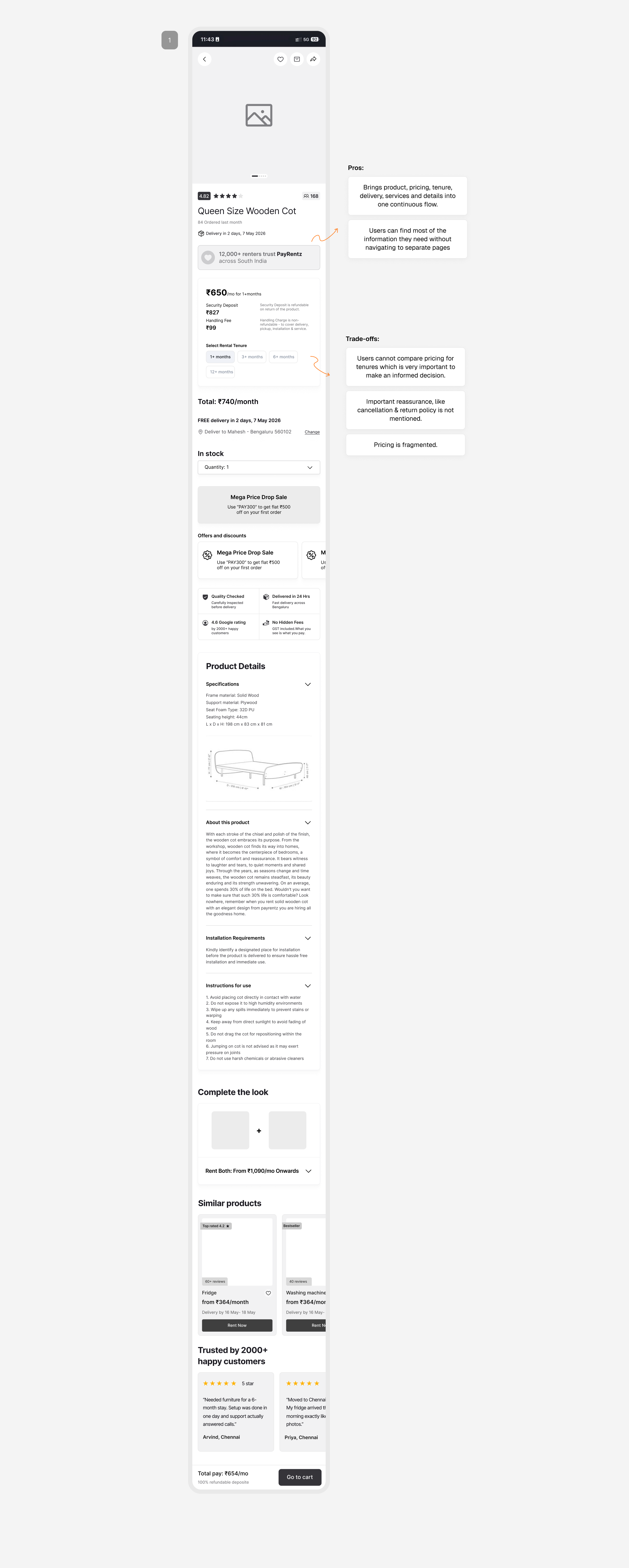
01 · I started by bringing the major decision-making information into one flow
01 · Product imagery and name02 · Monthly rental price03 · Rental tenure04 · Offers and discounts05 · Delivery information06 · Services and reassurance07 · Product specifications08 · Recommendations and reviews
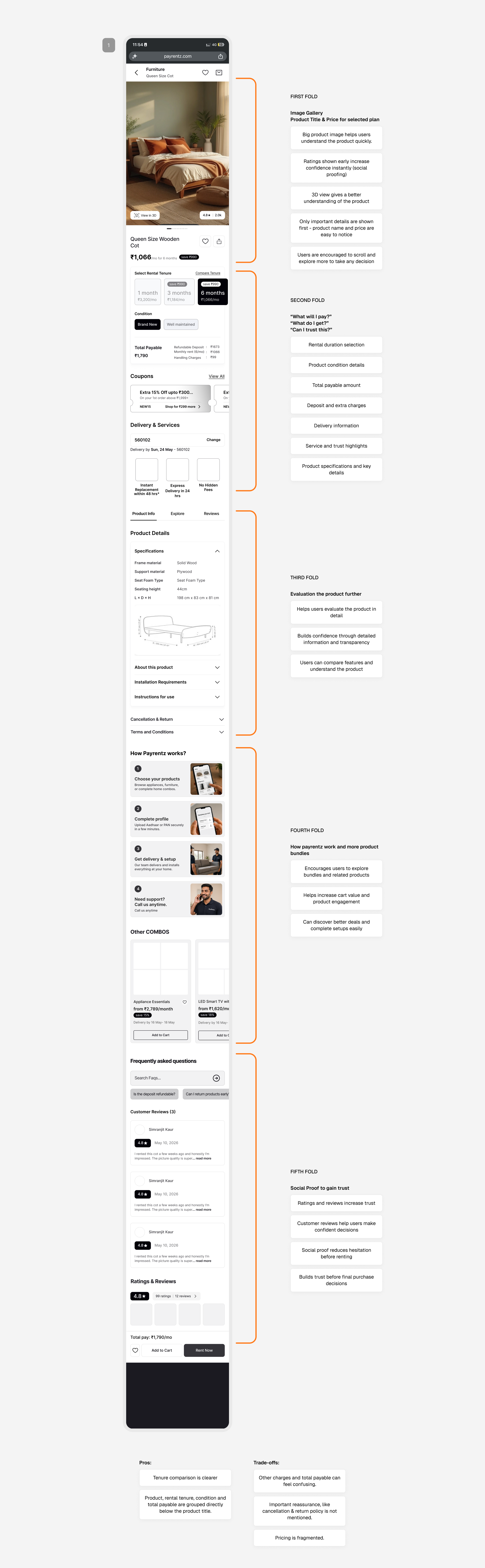
02 · Structuring the rental journey
I started using visual hierarchy, grouping, and spacing to make a lot of necessary information easier for users to scan and understand.
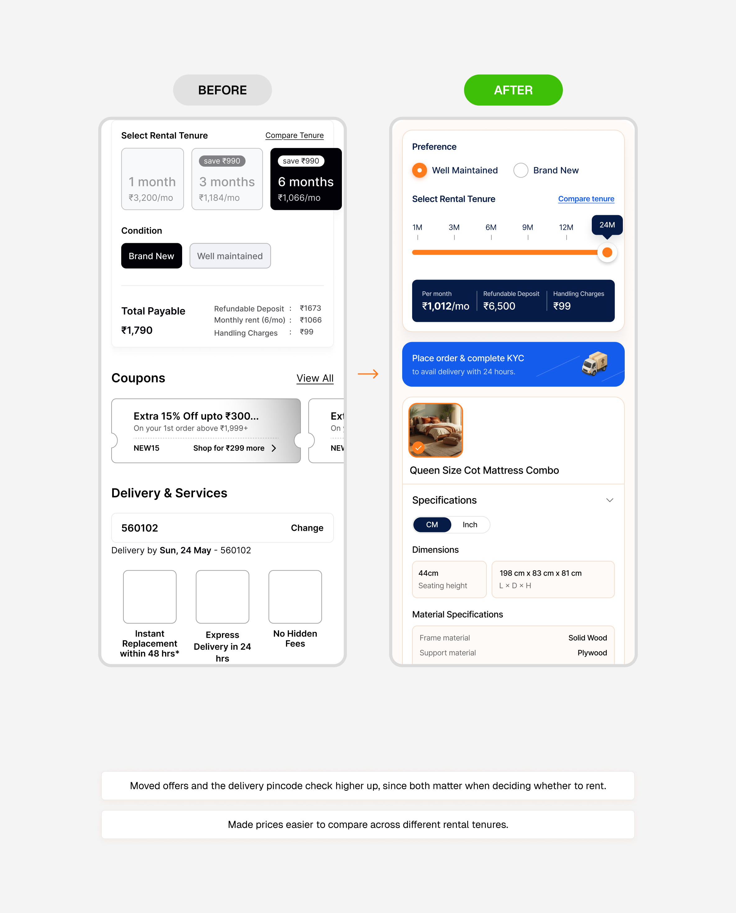
Improving the PayRentz PDP Screen
Each pair compares my earlier wireframe with the final design.
10 · Wireframing
Wireframing
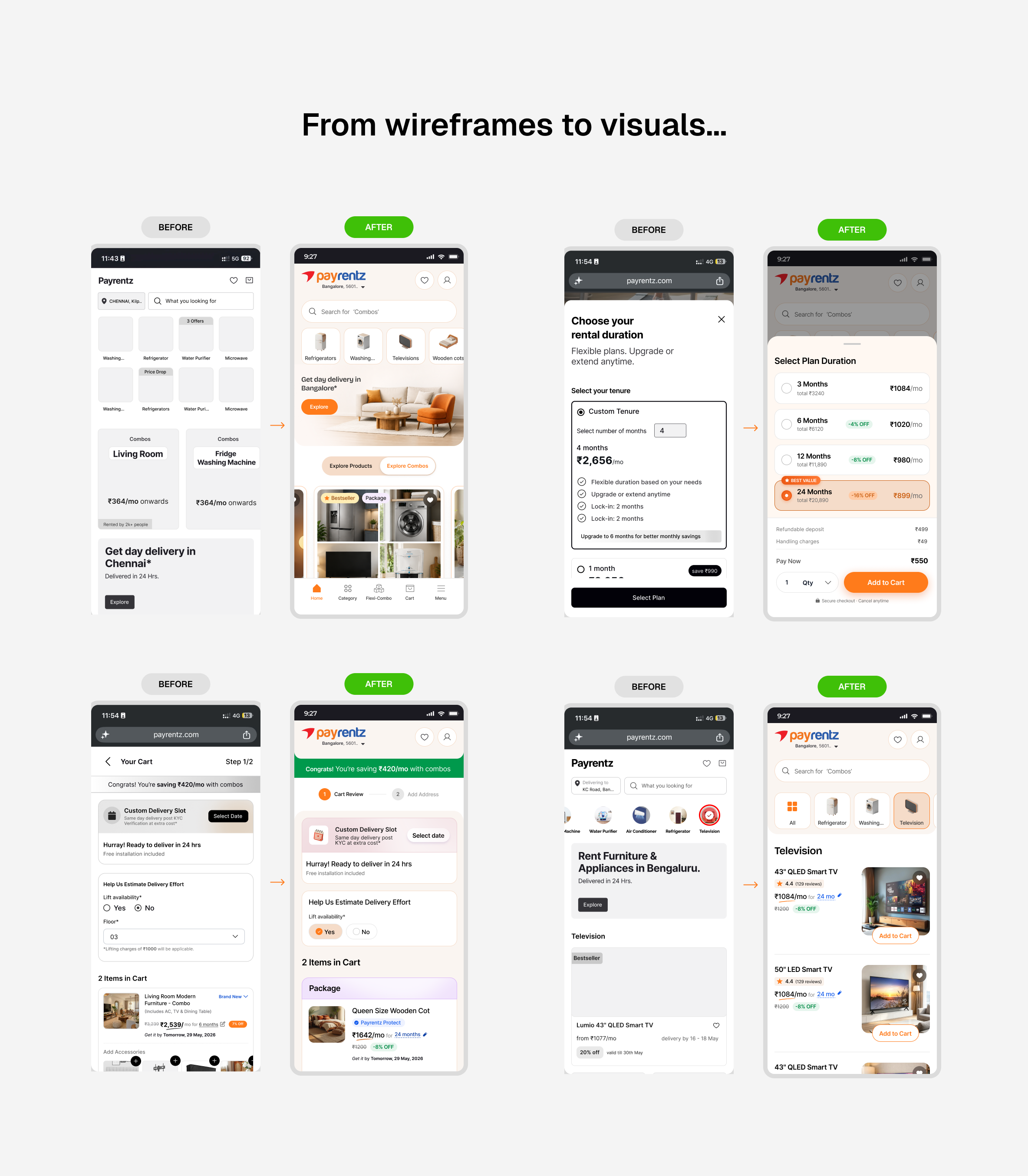
I wireframed the mobile journey from home to checkout and account pages, and reviewed options with the team before moving to high fidelity.
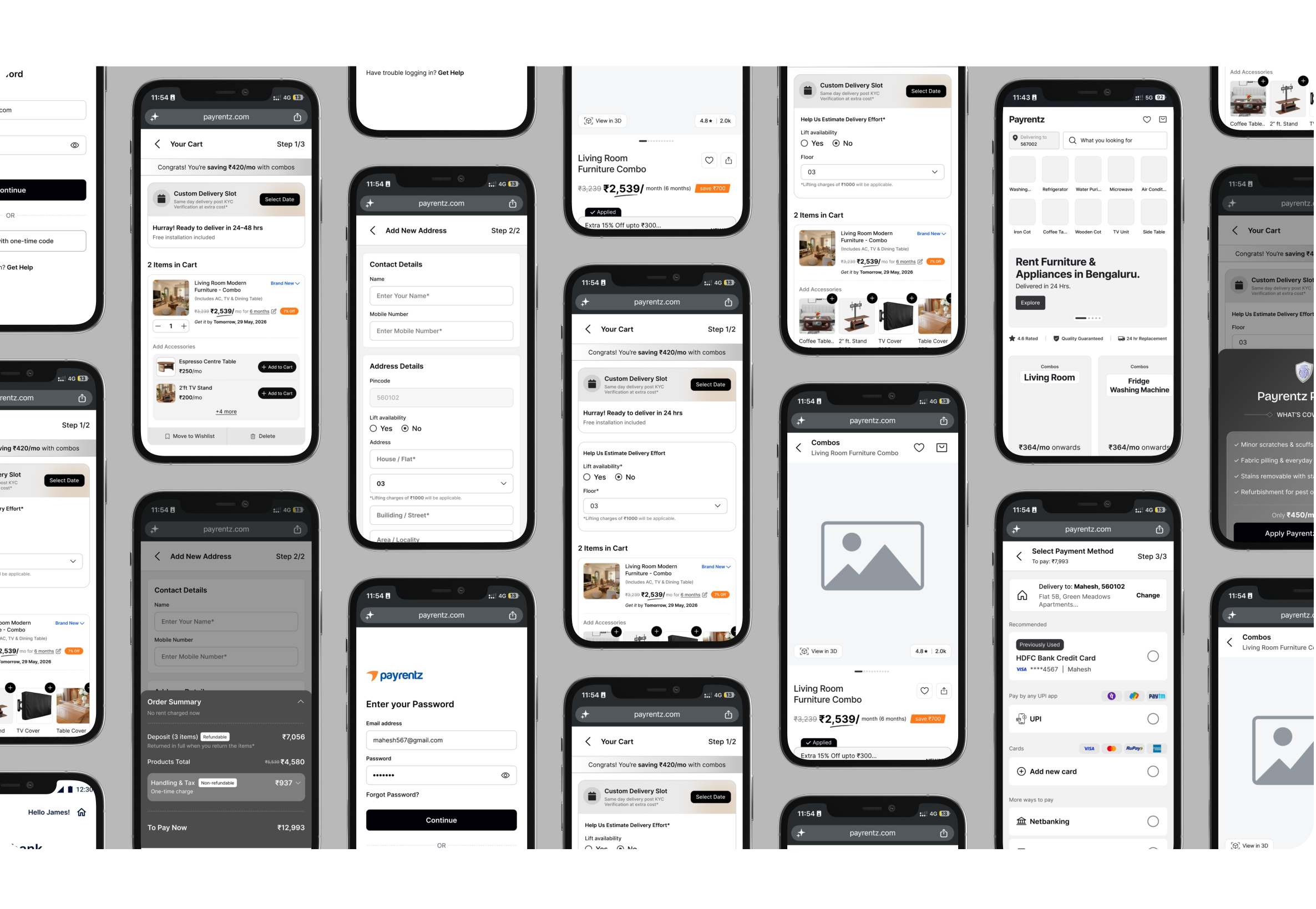
From wireframes to visuals...
11 · Design system
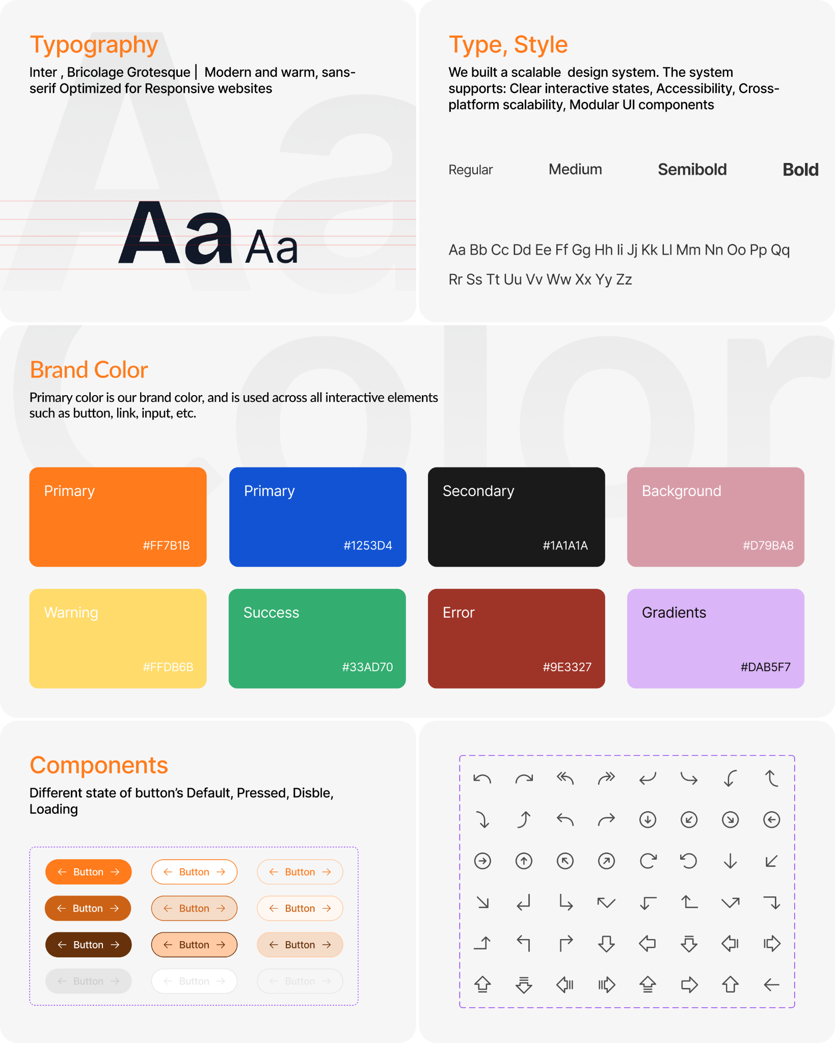
Design System
12 · Results
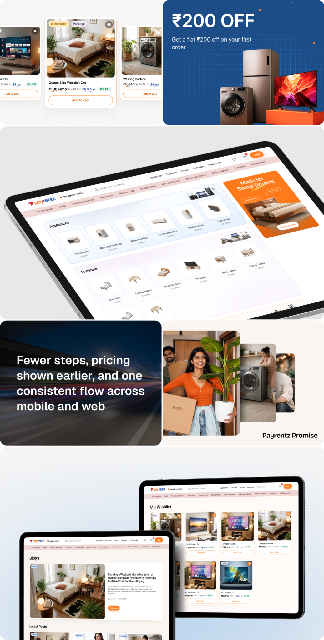
What the team delivered
My part: I wireframed the mobile flows for discovery, product pages, cart, checkout and account.
0 → 1
Built the complete product experience from the ground up, establishing the foundation for a scalable rental platform across web and mobile.
50+
Designed reusable components and patterns as part of a scalable design system, enabling faster product development and consistent experiences.
15+
Core user flows designed, including onboarding, product discovery, Flexi Combo, Compare Tenure, checkout, and account management.
13 · Reflection
My learnings
The process started with an audit of the existing PayRentz experience, then competitor research on Furlenco, Rentomojo, CityFurnish, GuaRented, and then wireframing the core flow — homepage through to checkout. Then we took it into high-fidelity, working together to build out the design system and final screens.
The audit taught me something I didn’t expect: the bigger issue didn't seem to be complexity but timing: key details like deposit and delivery appeared too late. Working the wireframes end to end meant thinking about how a decision on one screen impacted the next, rather than fixing screens in isolation. Moving into high-fidelity with the rest of the team meant defending those decisions out loud.